A mobile app designed to help remote workers find a puclic place to work.
This was a solo project following Google Ventures Design Sprint, a five-day approach modified for a team of one.
My role
UX Researcher
UX Designer
Duration
5 Days
Tools
Figma
Marvel
Problem
Finding a public place to work remotely from should be easy, but that’s not always true.
PostUp is a new app where freelancers and remote workers share tips and advice. Recently, they started to see a lot of feedback and discussions about how to find good public places to work from. PostUp is looking for solutions to streamline the process for users and charge a monthly subscription fee for the service.
My Solution
An end-to-end experience making finding a great place to work quick and pain-free.
Remote workers can easily search, filter, select, and get directions to a suitable remote work place all from one platform.
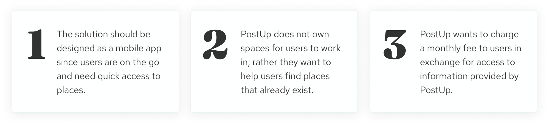
Constraints
PostUp had 3 constraints that I needed to work with.
Day 1: Understand & Map
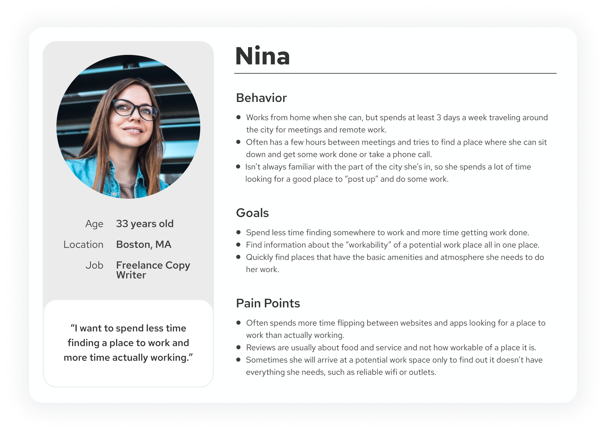
User Persona
On Day 1, I wanted to get a grasp on the problem space and empathize with PostUp’s users. I started by analyzing the primary research and user interviews provided by PostUp. I took the insights gained from this and updated the persona (originally created by PostUp) to reflect my new insights.
Notable Insights
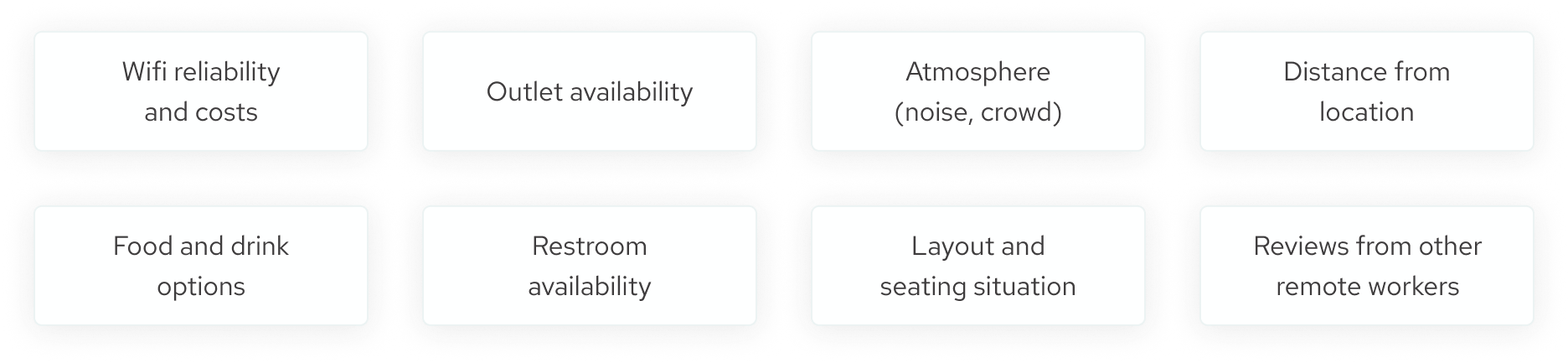
From synthesizing data provided by PostUp, I identified eight amenities and details users want to know about before committing to working at a particular work space.
Problem Statement
How might we make searching for a suitable work space simple and quick for remote workers?
With an understanding of PostUp’s users, I was able to define the key problems to solve and refine my problem statement.
Map
Having a clear understanding of the problem I was solving, I jumped right into exploring possible solutions. Of the handful of ideas I sketched out, the one below best addressed the problem and conveyed my solution.
Day 2: Sketch
Lightning Demos
To start off Day 2, I spent about 30 minutes getting inspiration from existing solutions for similar problems. I specifically looked at popular apps and websites that provided some sort of directory to help users find something they’re looking for.
Yelp
First, I chose to look at Yelp because it’s usually one of the first apps I turn to when looking for a place to work. I took special note of:
Beneficiaries rely on support providers to access their environment.
Support providers are primarily freelancers who find work/assignements through agencies.
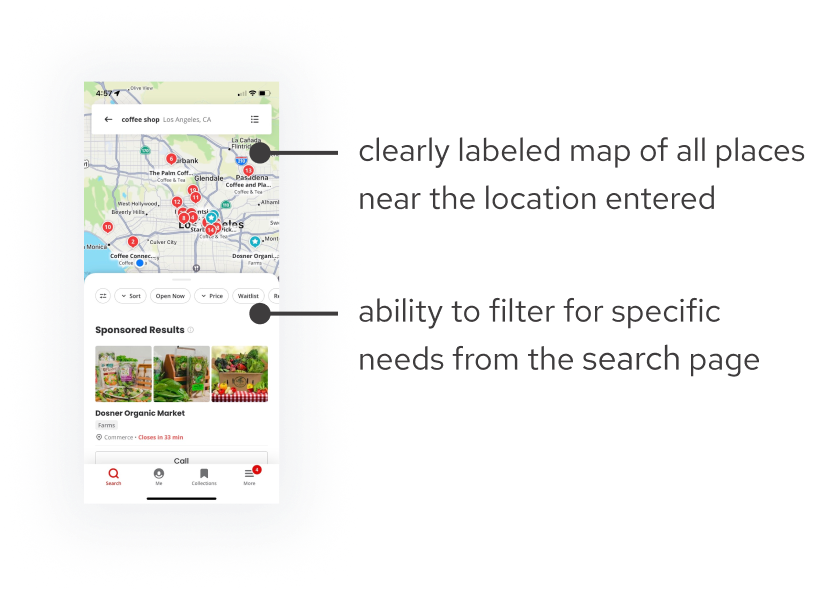
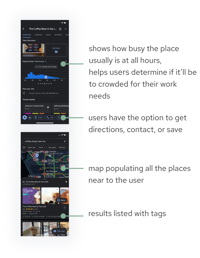
Google Maps
I then jumped over to Google Maps, which is where I would usually look next. I took inspiration from a few features from Google Maps:
The “popular times” section would be helpful for PostUp users since many users spoke about looking for quiet spaces and avoiding crowds
The ability to get directions to the location
A map that shows all nearby locations as well as the user’s location so that users can gauge how far they are
A results list with tags showing the users important filters that they may have selected
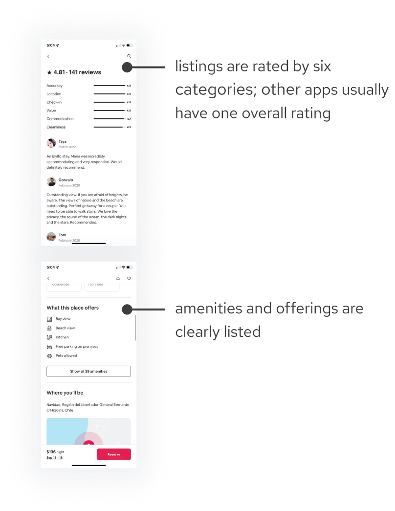
Airbnb
Next, I decided to look at Airbnb. Though it does not provide the exact solution of finding a public place to work, it provides a similar solution of helping users find short-term places to live. One thing stood out to me:
A pain point for PostUp users is that most apps and websites mainly review the food and service of a place. On Airbnb’s app, ratings are divided into six categories. This gives more transparency on how a listing is rated. A similar feature would be highly beneficial for PostUp users to see ratings for food vs. workability.
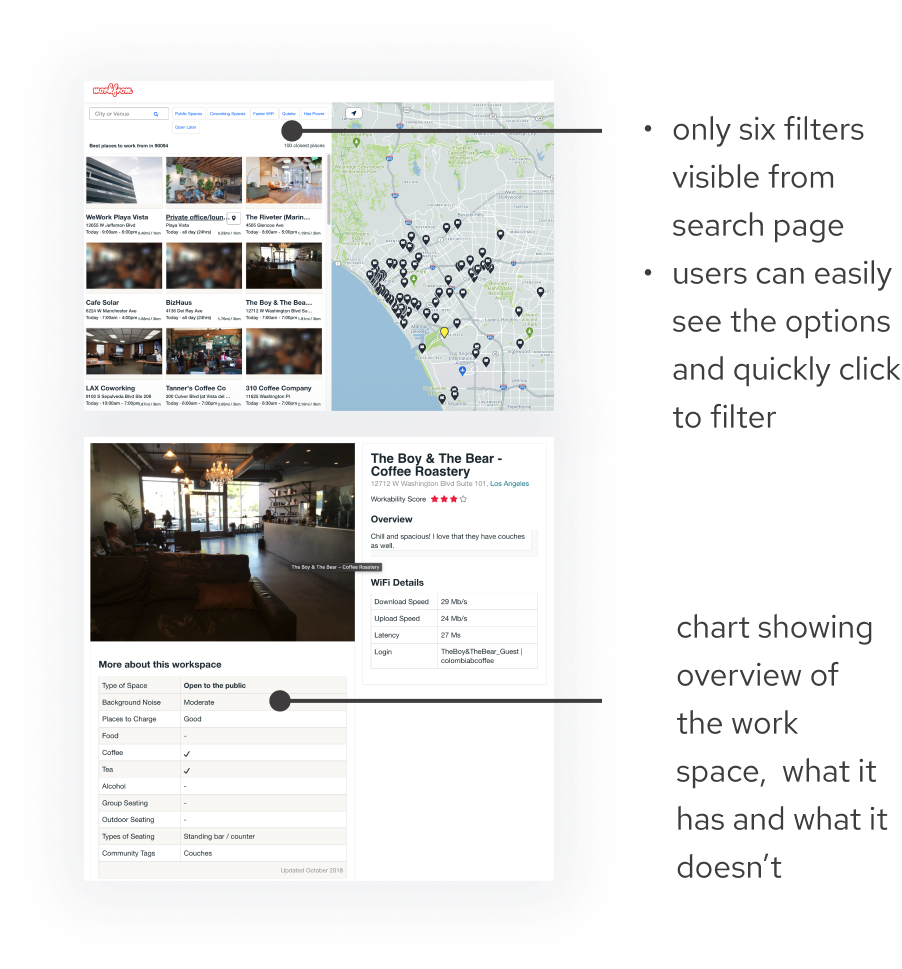
Workfrom
Interested in seeing if there’s an existing app or website that helps remote workers find public places to work, I did a quick search and found Workfrom. I was inspired by how simple, yet valuable its content is.
Only the most important and most used filters are listed on the homepage
The profile page clearly lists out work-related details and amenities (number of places to charge, type of seating, noise level, type of space, etc.)
Crazy Eights
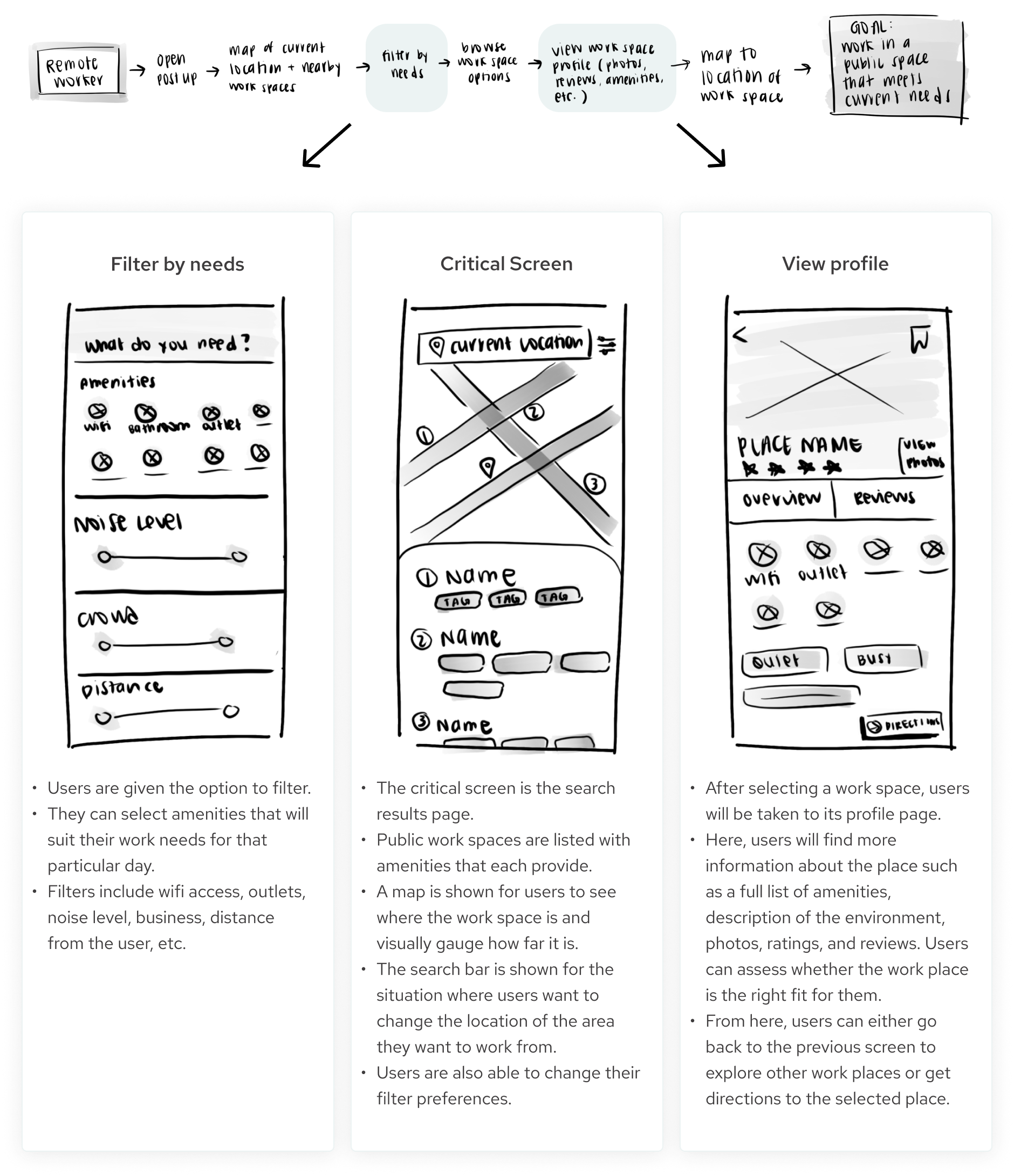
Looking back at Day 1’s map, I deduced that the “browse work space options” would be the most critical screen for PostUp. This screen is where users would look at all possible work options, compare them, and make a selection. Prior to this screen, users would have already inputted their location and selected their special requirements.
Using inspiration from other successful apps and keeping users’ needs and pain points at the forefront, I began to sketch variations of the critical screen. I used the Crazy Eights method, sketching eight ideas in eight minutes. Here’s what I came up with:
Solution Sketch
From the eight solutions I sketched above, I selected one design that best fulfilled the role of solving the user's problem. I then sketched out the screens that would come before and after it. This solution sketch gave me an idea of how the user would interact with the interface.
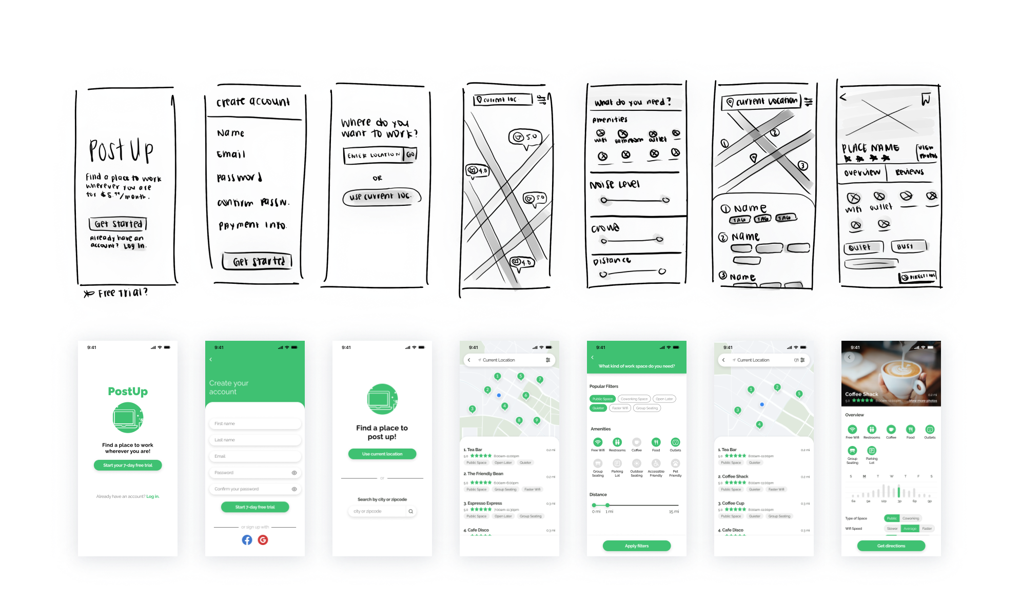
Day 3: Wireframe
Wireframe
On Day 3, I sketched out a lightweight wireframe for the remainder of the screens. I made sure to include the necessary elements that I'd need to build the prototype. Here’s how I envisioned the app working:
1) Users are prompted to sign up or log in.
This is where the user’s journey begins.
Returning users can select to sign in.
New users will be guided to create an account.
Since PostUp wants to charge monthly fees to access their information, I noted down the idea of adding a free trial option for users who are not ready to commit just yet.
2) New users will create an account.
New users will create an account on this page.
This is also where payment information will be collected for PostUp’s monthly subscription fee.
3) Users start the search by inputting the location they’re looking to work in.
In order to populate relevant work places, users are prompted to input their location of choice.
Users can either select to use their current location or input a different location if they’re not currently in the area of where they will be working.
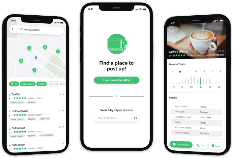
4) Users are then shown the work spaces around the area they searched for.
Users are shown a map of places to work near the area that they inputted.
Places are labeled by type of facility and ratings
From this page, users have the option to filter for their needs.
5) Users then filter by their needs, learn more about each work space, and get directions to the location they choose to work at.
These next three screens were discussed in the previous section (section: solution screens)
Day 4: Prototype
Creating the Prototype
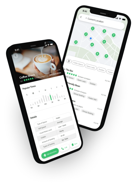
Day 4 took us to prototyping. With the sketched wireframe from Day 3, I used Figma to create the high fidelity prototype. The high fidelity version is similar to the sketches in most ways. Here is a side-by-side of the iterations of each screen.
Key changes and additions:
Changed the CTA from “Get started” to “Start your 7-day free trial” for more clarity of what the user is signing up for.
Since users are not expected to pay for their account until the free trial is over, I removed the user’s need to input payment information. This may help users feel more comfortable moving forward with creating their account.
I added the ability to sign up with Facebook or Google to speed up the sign up process.
The initial results page originally only provided a map of the results. In the hi-fi, I added a list to provide more information about each work place.
Day 5: Test
Testing the Prototype
On Day 5, I went out and tested the prototype with five users. I specifically looked for test participants who work remotely in public places at least once per week. Users expressed that the prototype was straightforward and easy to navigate. No major usability issues were found, but minor issues and interesting insights were uncovered.
Findings
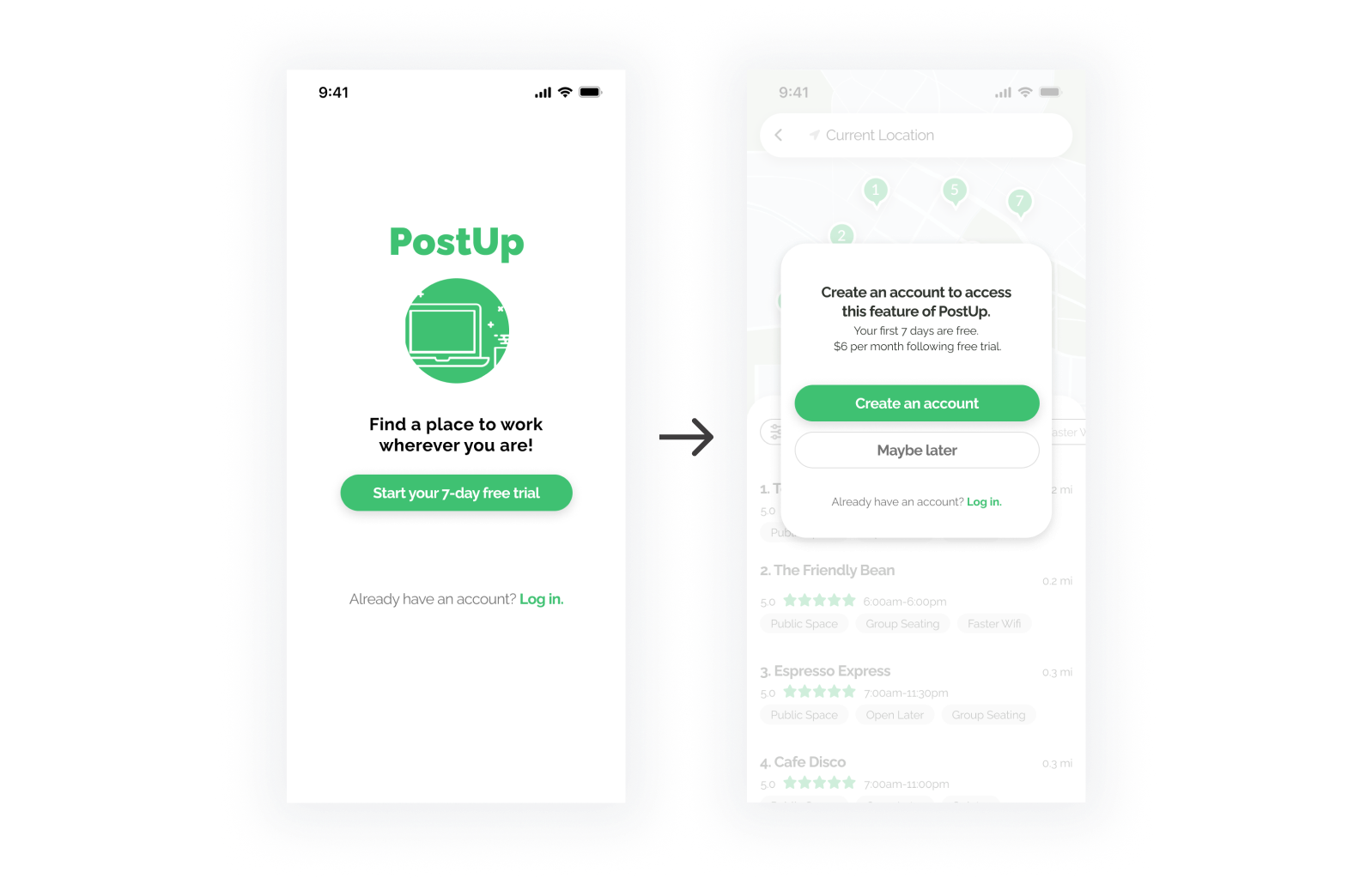
Issue #1
A couple users noted that in a real scenario, they would abandon the app upon seeing “start your 7-day free trial” because it implied that they may need to create an account and input payment information before knowing much about the app.
Solution
In the next iteration, I delayed account creation. Once opening the app, users have access to a free version of the app that provides limited functionality. After browsing, users are prompted to create an account to continue using the app.
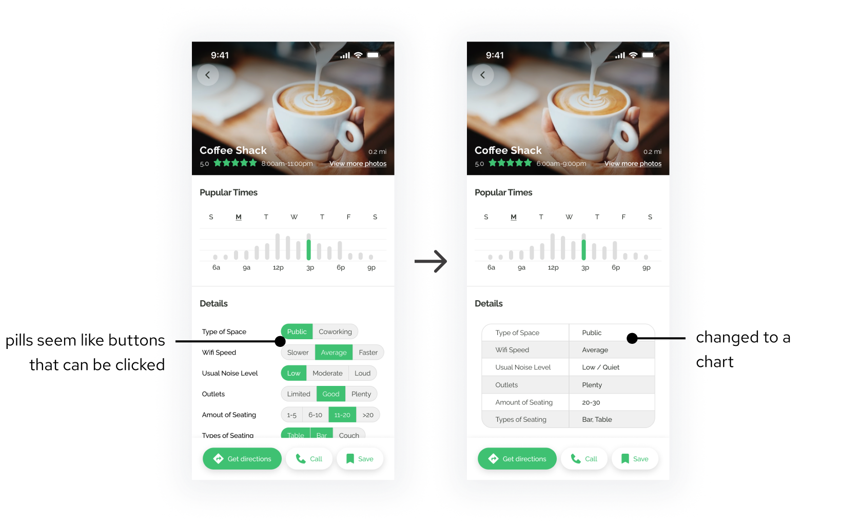
Issue #2
Users commented that the “details” section looked like clickable buttons.
Solution
I changed the format of this section into a chart so it better conveys that it is informational content.
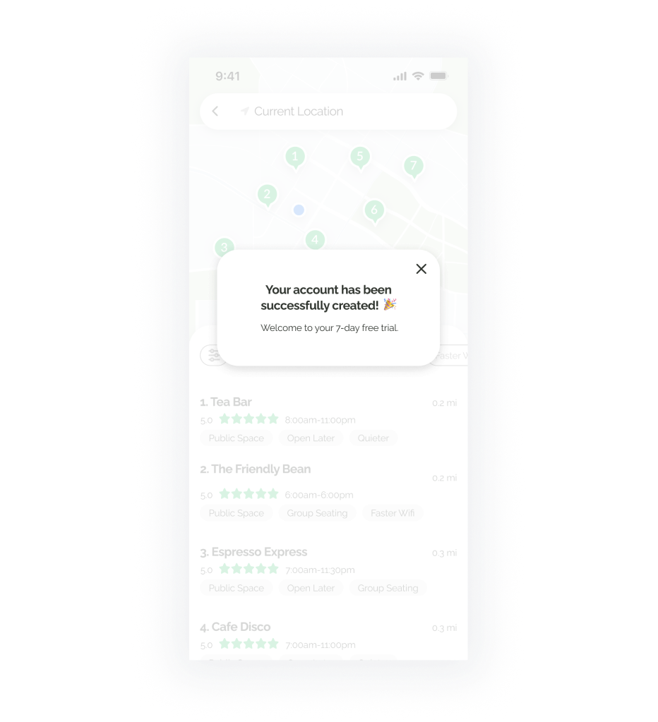
Issue #3
One user noted that she was not sure if her account was created after clicking “create my account.”
Solution
This was a fair point since users are not given any feedback once they’ve clicked “create account.” I added a pop-up to inform users that their account was created.
Interactive Prototype
Check out the current iteration!
Conclusions
What I Learned
The initial thought of completing a project in five days sounded daunting to me, but I found that it was completely doable, especially when following a structure. I applied more pressure to myself with this project, staying strict with time boxing each phase of the process. I surprised myself with how quickly I was able to work. I generally get stuck on making things perfect before I go on to the next step. Moving rapidly for this design sprint did not allow me to get stuck on perfection, which in turn warmed me up to imperfection.
Overall, I had so much fun with this design sprint! The biggest wins were: