Stride

A case study on making fitness social.
This was an independent project using the design thinking process.
My role
UX Researcher
UX Designer
Duration
3 weeks
Tools
Figma
Marvel
Problem
Stride is noticing high user drop off rates after 3 weeks of usage.
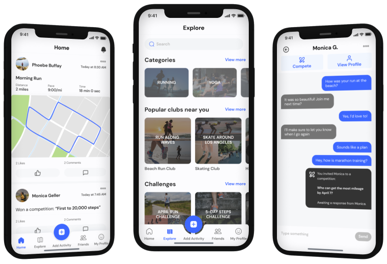
Stride, a well-established company, launched a fitness app three years ago. The app allows users to share health and fitness updates with family and friends. Users can create health goals, monitor them, and share achievements. Users are also able to search and sign up for fitness clubs and events around their area.
On average, user engagement is heavy for the first three weeks then it drops off and users delete the app soon after. There are currently no features to message other users or alert friends of achievements. Stride wants increase engagement and repeat usage by integrating messaging and social features into their app.
Talking to Fitness App Users
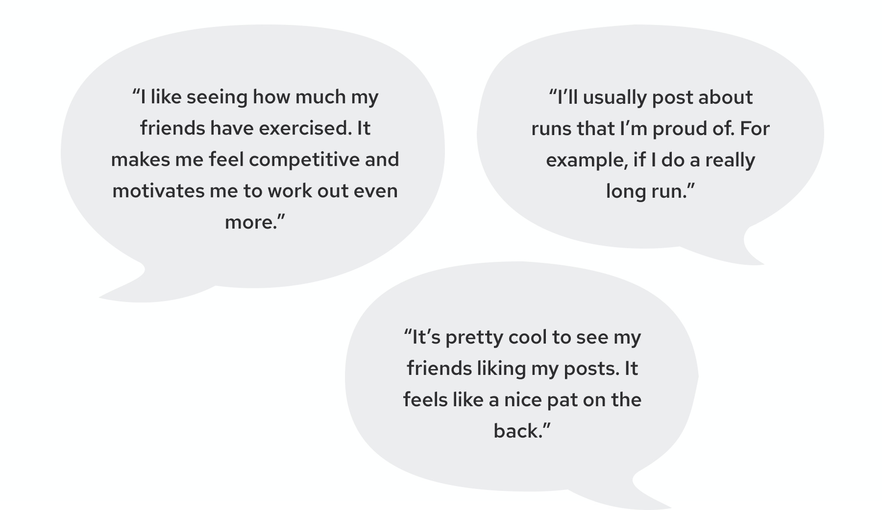
To start the discovery phase, I interviewed five users of fitness apps to better understand their behaviors and attitudes when it came to fitness apps and social features. Users spoke positively about social fitness apps that they have used in the past. Check out what some users shared:
Competitive Analysis
From my five interviews, the most talked about competitors were Apple Fitness, Strava, and Nike Run Club. Because of this, I decided to analyze these three competitors to get a glimpse of how they’re tackling the challenge of incorporating social features into their product.
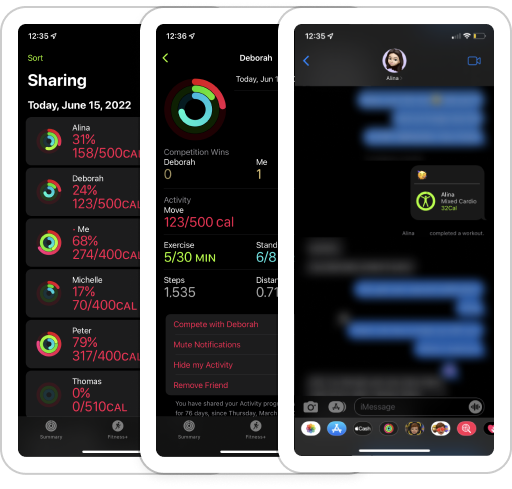
Apple Fitness
  • View friends’ daily activity and achievements on profiles
  • Receive immediate notifications upon friend’s completion of an activity or accomplishment, but no feed
  • Respond to notifications via iMessage
  • Compete with friends by collecting points through burning calories, exercising, and standing
  • Gain badges to display on profile by reaching exercise achievements and participating in competitions
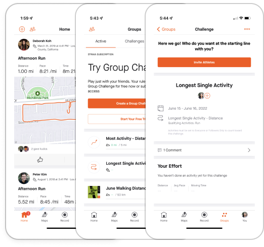
Strava
  • Feed showing latest activity from friends and community
  • Users can comment and like posts
  • Workouts can be shared to the feed upon completion
  • Create private fitness challenges and invite friends
  • Private groups between friends where users can post and create competitions privately
  • No feature to privately message friends
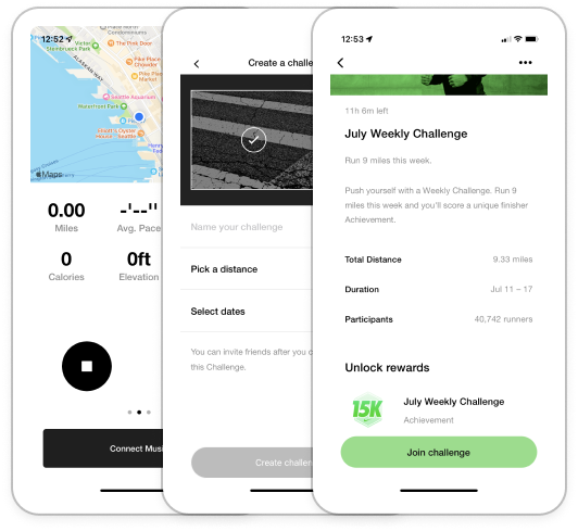
Nike Run Club
  • Record runs and share stats with friends
  • Create running challenges and invite friends
  • View leaderboard to compare stats between friends by week, month or year
  • Join community challenges and view stats of top performers
  • Earn badges for accomplishments to display on profile
Drawing Key Insights
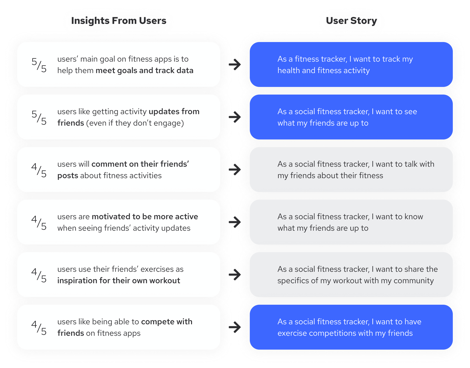
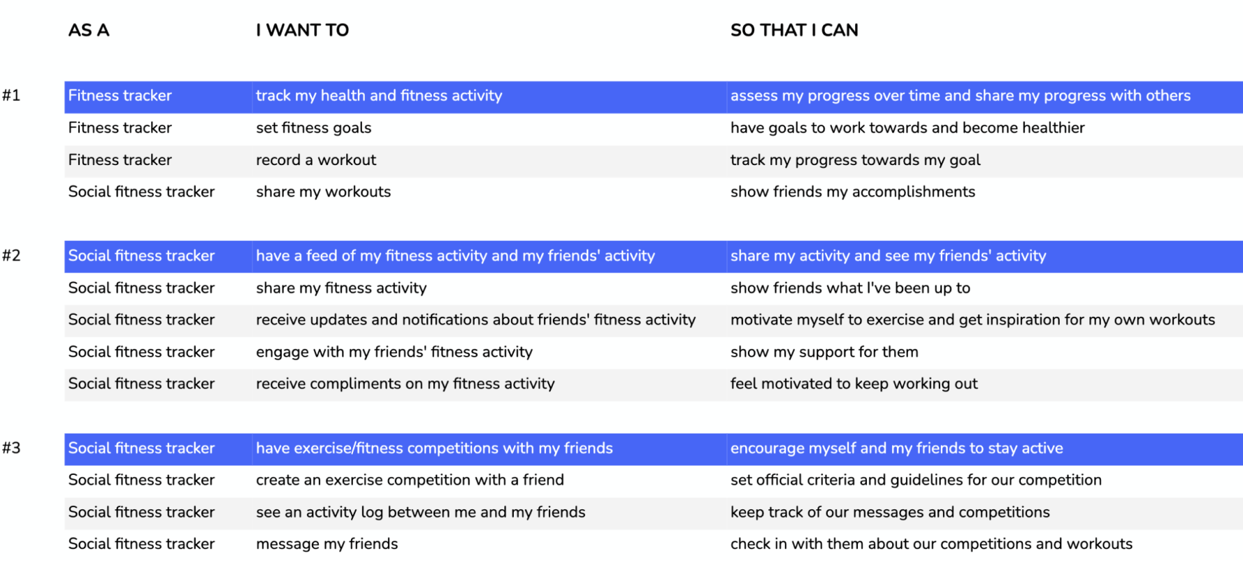
After investigating competing apps, I went back and extracted data from my user interviews to find key insights by creating an affinity map. These insights helped me generate possible high level user stories for Stride. The highlighted stories below were selected to generate more detailed stories.
User Stories
With the high level user stories derived from our user insights, I generated more detailed user stories and defined what functions were integral to Stride’s social features.
User Flow
After identifying the user stories, I developed three user flows in order to map out how a user would interact with the product to complete these tasks.
Flow #1: Record and share fitness activity
Flow #2: View, comment, and like a friend’s fitness post
Flow #3: Message a friend and invite them to an exercise competition
Sketching and Guerilla Testing
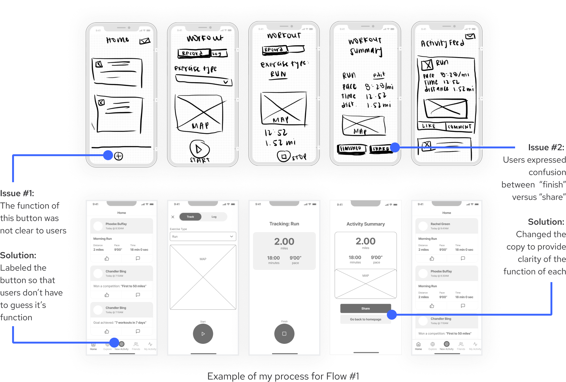
With clarity of the users flows, I began ideating. I started by sketching different versions of each screen, thinking about the elements that would need to be included, where they would be placed, and how users would interact with them. Once I had a working solution, I conducted a quick round of guerilla testing to catch major usability issues.
From Sketches to Wireframes
I used the insights I gained from guerilla testing to guide my design changes for the next iteration. Being more confident in the design, I moved the process from paper onto Figma in order to better capture what the screens would look like.
Validating The Design
Usability Testing: Round 1
I recruited five users of fitness apps and conducted a round of usability tests. I wanted to find out if users would be able to easefully use Stride’s new social features. Specifically, I asked them to complete the following tasks:
Task 1:
Record a run you’re about to do, then share it with your friends
Task 2:
Check out what kinds of workouts your friends have been doing recently and show them your support
Task 3:
Check in with a friend to see how their training has been going and challenge them to an exercise competition
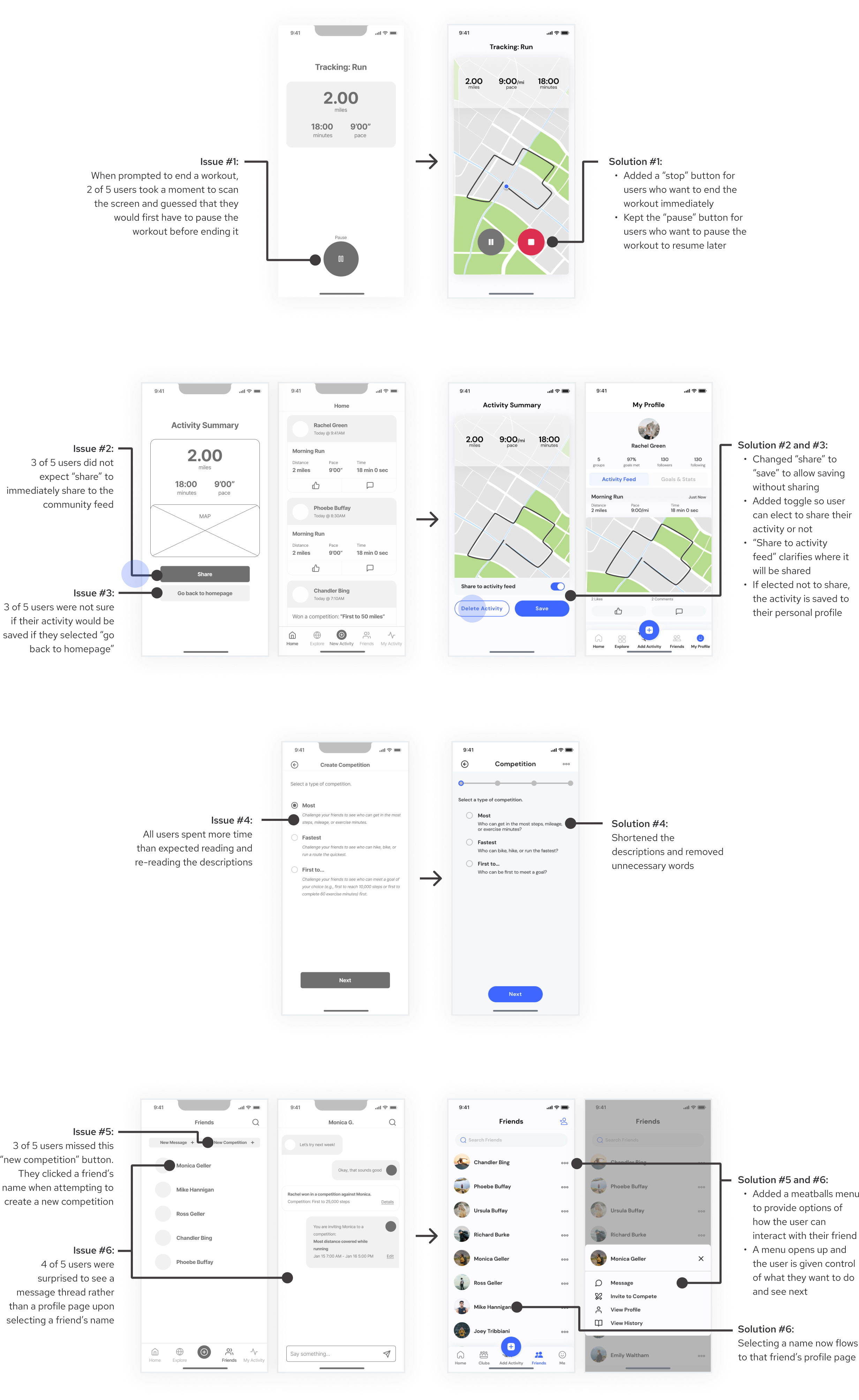
All test participants were able to complete each task without any missteps. Though no major usability issues were uncovered during this round of testing, users help me identify minor issues that could be improved.
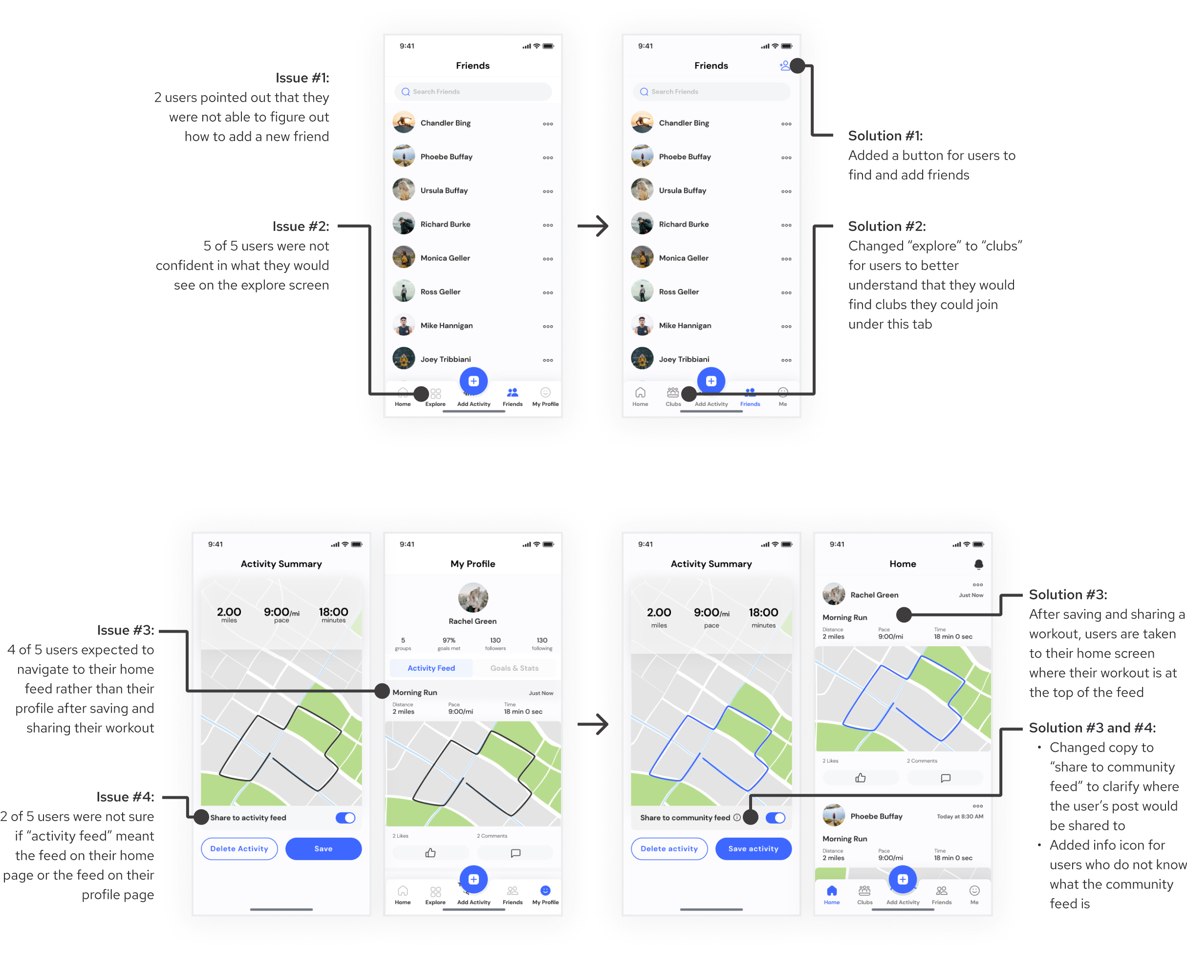
Usability Testing: Round 2
Given the feedback from round one of testing, I made design changes to improve the usability of the prototype. I then took the next iteration through another round of usability testing with five new users and continued to iterate based on my findings.
Interactive Prototype
Check out the current iteration!
Next Steps
This is just the beginning for Stride’s social features. The next challenges I’d like to tackle would be:
  • Conduct usability testing on the new iteration and continue to make design changes to increase ease of use
  • Evaluate user metrics to determine if the new social features are driving engagement and repeat usage
Previous Case Study:
PostUp