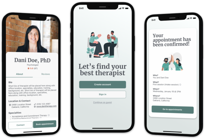
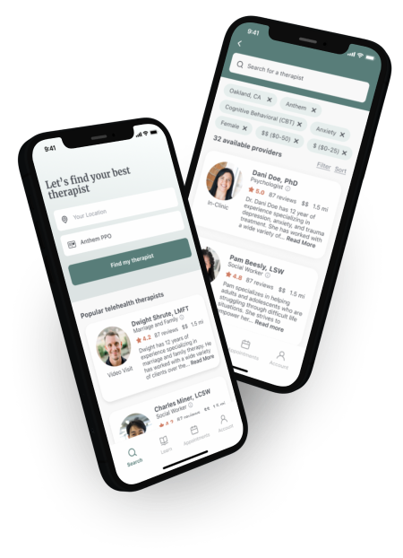
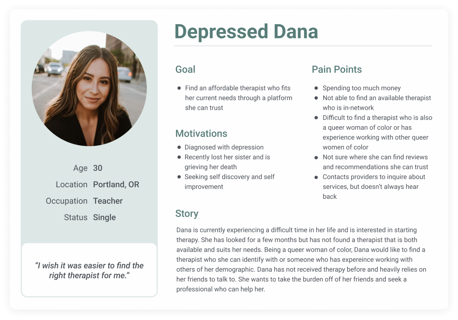
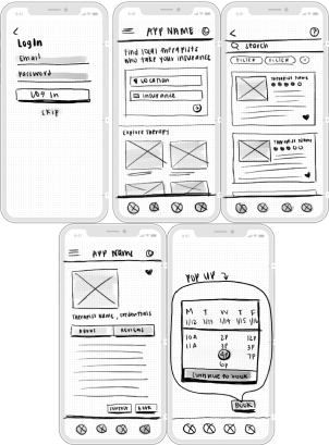
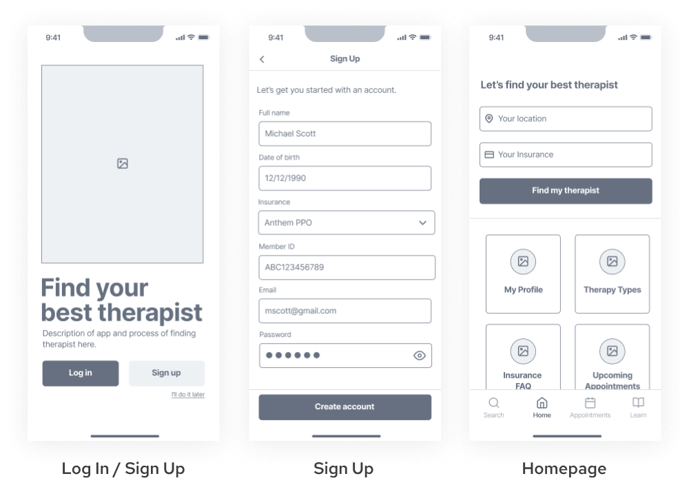
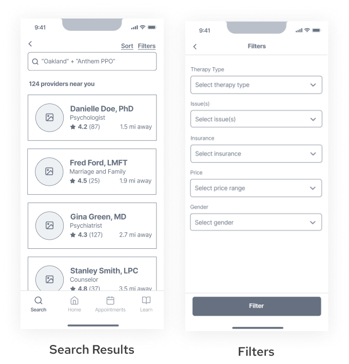
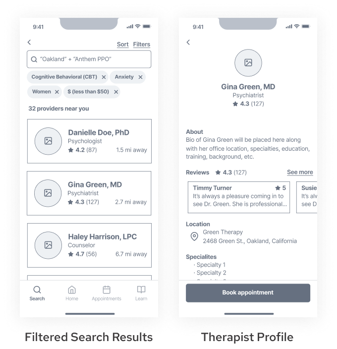
TheraFind

An end-to-end experience that makes the therapist search simple and painless.
This was an independent passion project driven by the challenges my peers and I experienced while seeking therapy during the pandemic.
My role
UX Researcher
UX Designer
Duration
8 weeks
Tools
Figma
Marvel
Problem
American adults are experiencing difficulty accessing therapy services.
During the pandemic, my mental health was at an all-time low and I accepted the fact that I needed help. Upon beginning the quest to find myself a therapist, I was immediately overwhelmed and confused by the process. Reaching out to friends and acquaintances for advice, I came to find that we were all experiencing similar challenges. Digging a little deeper online, it became clear to me that this issue expanded beyond just me and my circle of friends.
57%
of all adults with mental illness reported receiving no treatment in 2020
Mental Health America
4.9M
adults were not able to access the mental health care they needed in 2020
National Alliance of Mental Illness
22%
of patients who wanted access to mental health care faced barriers in 2020
National Council of Behavioral Health
My Solution
TheraFind, an app that helps patients find and connect with compatible mental health providers.
My goal was to make therapy services more accessible to patients. I produced this project independently using the design thinking process.
User Discovery
I interviewed 5 individuals who recently sought out therapy.
I wanted to get a grasp on three things:
  • the kinds of people struggling with accessing therapy
  • why they are struggling
  • what would help them overcome those barriers
Key Insights
With the data I collected from user interviews, I created an affinity map to identify patterns and draw insights. Here are the six key insights that were revealed:
User Persona
Users are struggling to find available and affordable therapists who fit their specific needs.
Based on my findings from the discovery phase, I created this persona of Dana, which highlights the main motivations and goals of TheraFind’s target user. Dana encompasses the average user based on my research.
Problem Statement
How might we help our users access affordable therapists who fit their needs so that they can stay on top of their mental health?
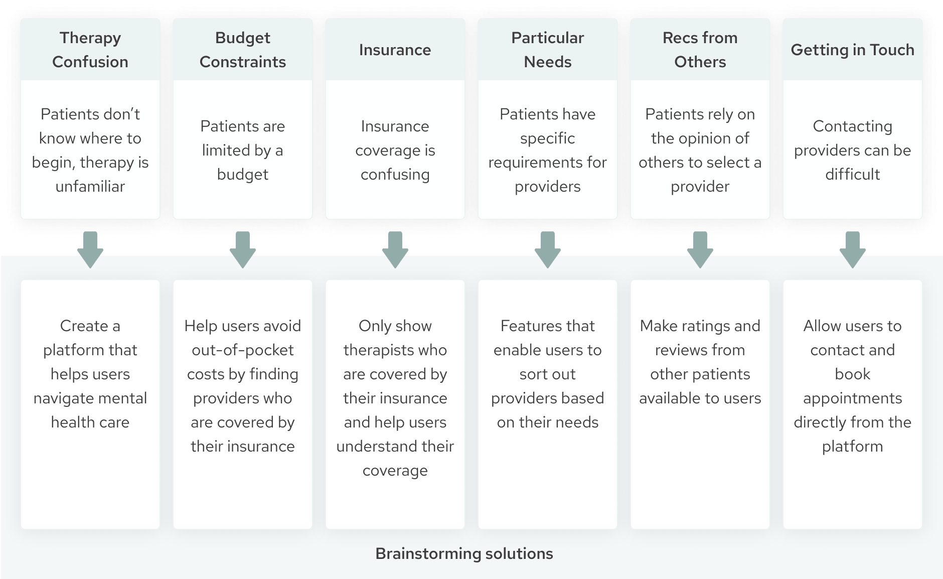
With a clearer understanding of TheraFind’s users, I recrafted my problem statement to address the overarching issues I wanted to solve.
Ideation
Now that the problem and the users were clearly defined, I began brainstorming solutions. I took the key insights found from user interviews and ideated possible solutions for each.
User Stories
User stories helped define which functions were integral to finding a therapist.
These user stories guided the project in keeping the product user focused. It served as a reminder of user goals as well as helped prioritize how each screen is designed.
User Flow
A user flow was developed to understand the necessary steps to book a therapist.
The user stories above helped narrow down the features that were most critical to include in the booking flow. To come up with a flow that made sense for the user, I analyzed the user flows of existing platforms that solved similar problems. I then drew parallels to the features and functions to realize what was necessary to include in the booking flow.
The user flow below visualizes the route users would take to successfully find a compatible therapist and book an appointment.
Sketch + Guerilla Test
The next step was to bring the product to life and run a quick round of tests.
I sketched out what each screen of the user flow might look like, making sure to include all of the critical elements identified in the user stories. I chose to design in mobile first in order to prioritize only the most important elements.
Guerilla testing helped uncover the following three insights:
  1. Users had differing opinions on the flow.
    1. Originally, users were asked to create an account at the time of booking an appointment, similar to the checkout experience for online shopping.
    2. Some users were confused about why sign up was so late in the process. Others liked the ability to explore before committing to creating an account.
    3. When it came to wireframing, I opted to allow users to decide their flow. They would be able to either sign up/log in from the get-go or explore first.
  2. Icons without labels were confusing to some users.
    1. Users commented about being unsure what would happen upon clicking some icons and buttons.
    2. In the wireframe, I labeled every icon and button to reduce uncertainty.
  3. The homepage was confusing.
    1. Some users were not sure how to proceed from the homepage.
    2. The unlabeled icons played a role in that.
Wireframe
With user feedback, I iterated on the design and created the first digital prototype in low fidelity.
Here is how it works:
1) The user optionally goes through an initial onboarding.
TheraFind uses the user’s information to curate a list of therapists for the user. If the user elects to skip onboarding, the homepage prompts the user to search for a provider based on their location and insurance.
2) The user is given a list of therapists who accept their insurance and are local to them.
Users have the option to further narrow down the list by applying filters based on their needs and requirements.
3) The user can learn more about each therapist who is of interest to them.
Each therapist has a profile page which includes reviews from other patients and details such as their professional background, specialties and location.
4) Once the user finds a compatible therapist, they request an appointment directly on the app.
TheraFind connects the patient to the therapist and simplifies scheduling and communication for both parties.
Visual Design
Next, it was time to add visual design to represent TheraFind as a trusting platform.
With mental health being a sensitive topic, styles were chosen to help users feel at ease.
Green was selcted as the primary color to convey TheraFind as a place of peace, safety, and healing. Orange was chosen as a secondary color to add warmth. Rounded corners are used across the app to soften the screens and give a sense of gentleness.
Prototyping + Testing
Taking the style guide I created, I checked it for accessibility and applied it to the screens. I then converted it into a prototype and conducted two rounds of usability testing. No major usability issues were found from user testing, but a number of minor issues were identified.
Testing: Round 1
Issue #1
Not all users are familiar with technical terms used in therapy. Therapist credentials, therapist titles, and therapy specialties were not fully understood by all users. The current solution of having a separate section designated to learning about therapy proved to be inefficient. It required users to navigate between screens to understand what they were reading. Most users were also not aware of that feature.
Solution
Add information icons next to each technical term. When clicked on, a pop up would appear with an explanation of the term.
Issue #2
There was no way for users to contact the therapist if they had inquiries.
Solution
Add a phone number and a website link for users to learn more or reach out to the provider. Also added a “contact” button that allows users to email the provider directly from the app.
Issue #3
Some users were unsure if the therapists they were looking at were accepting new patients. It wasn’t until the availability page that users discovered that they were taking appointments.
Solution
Change the search results to say “(number of) available therapists” rather than “(number of) therapists found.” Another solution would be to add an option to filter for therapists who are accepting new patients.
Testing: Round 2
Issue #1
Some users expressed confusion about the purpose of the "sign in later" button.
Solution
Reword "sign in later" to something that not only labels the function of the button, but also the purpose. For example, "continue as guest" or "browse before creating an account."
Issue #2
The current filter options do not cover everything that users might want to filter for.
Solution
In the next iteration, I would add filters, additional filters such as language spoken, ethnicity, credentials, and multiple insurances.
Issue #3
Some users were unsure if the therapists they were looking at were accepting new patients. It wasn't until the availability page that users discovered that they were taking appointments.
Solution
In the next iteration, I changed the search results to say "(number of) available therapists" rather than "(number of) therapists found. Another solution would be to add an option to the filtering page to filter for therapists who are accepting new patients.
Testing Conclusions
Though the minor issues, all 10 of 10 users easily completed the tasks of searching for a compatible therapist and booking an appointment. Missteps were not observed during these two rounds of testing.
Many users noted that TheraFind is more encompassing than the alternative apps currently available. It checks off all the boxes. Users stated that there are apps and websites out there that give users the ability to explore therapists, but only TheraFind gives them the confidence that the therapists being shown are covered by their insurance, helping them save on costs. Not only does it allow users to find therapists who suit their needs, they’re able to book therapy sessions in the same place. Users were grateful to be able to avoid phone calls and emails that often go unanswered.
Interactive Prototype
Design changes were made and a new prototype was created. Check out the current iteration!
Next Steps
What's next for Therafind?
  1. Make design changes based on user feedback, continue to test TheraFind’s usability, and iterate.
  2. In order to make this a viable product, TheraFind needs 2 types of users: patients and therapists. The emphasis of this project has been on patients. The next step will be to design for providers. I’ll need to identify the needs and pain points of providers and develop possible solutions within TheraFind’s platform.
What I Learned
I learned so much from this project!
  1. My ideas aren’t always going to work for everyone. And that’s okay.
  2. Testing and talking to users throughout the process not only helped me uncover issues with my designs, but also kept me in touch with users and their needs. Speaking with users frequently helped me keep my focus on designing a solution for the target audience and not for myself.
  3. Finally, I learned that the job is never done. There are always more questions to ask and things to improve.
Next Case Study:
Able Ally